
North Eastern PA Division major update
Re: North Eastern PA Division major update
 by buzz456 » Fri Sep 11, 2026 9:26 am
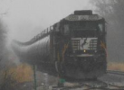
More shortly.
You do not have the required permissions to view the files attached to this post.
Buzz
39 and holding.
"Some people find fault like there's a reward for it."- Zig Ziglar
"If you can dream it you can do it."- Walt Disney
39 and holding.
"Some people find fault like there's a reward for it."- Zig Ziglar
"If you can dream it you can do it."- Walt Disney
-

buzz456 - Site Admin
- Posts: 21441
- Joined: Sun Mar 21, 2010 8:30 am
- Location: SW Florida
Re: North Eastern PA Division major update
by mindenjohn » Fri Sep 11, 2026 11:02 am
Chacal wrote:buzz456 wrote:Chacal wrote:harryadkins wrote:I've been working on a more modern logo for the North Eastern Railroad. Take a look and let me know what you think.
Harry
Awesome.
I think the diagonal line bisecting the "N" is distracting and not useful.
It's a rivet line on the car not part of the sign.
No, the diagonal line, not vertical.
I agree the diagonal line is distracting and the whole logo (great Job, Harry) would look better with a "proper/complete" N
John
I've a good memory for whatever I can remember!
If you wait for perfection you will never do anything but it doesn’t stop you wanting it.
Age doesn’t stop you, it just slows you down.
If you only learn one thing in life - learn to think how your actions and words affect others BEFORE doing or saying.
I've a good memory for whatever I can remember!
If you wait for perfection you will never do anything but it doesn’t stop you wanting it.
Age doesn’t stop you, it just slows you down.
If you only learn one thing in life - learn to think how your actions and words affect others BEFORE doing or saying.
- mindenjohn
- Posts: 1817
- Joined: Fri Oct 05, 2018 4:34 am
- Location: West Yorkshire, UK
Re: North Eastern PA Division major update
by harryadkins » Fri Sep 11, 2026 12:49 pm
To me, the diagonal line on the "N" helps keep it different from the "NS" logo. One of the parameters I set was to be a contemporary logo. That font style is really popular today. I actually like the diagonal line and to me it calls attention to the logo.
Harry
Harry
-

harryadkins - Posts: 3374
- Joined: Sun Aug 23, 2009 8:01 am
- Location: South Carolina, USA
Re: North Eastern PA Division major update
by buzz456 » Fri Sep 11, 2026 1:43 pm
harryadkins wrote:To me, the diagonal line on the "N" helps keep it different from the "NS" logo. One of the parameters I set was to be a contemporary logo. That font style is really popular today. I actually like the diagonal line and to me it calls attention to the logo.
Harry
No nit too small to pick Harry. I like it also. Anyway you do what you want. If someone wants to alter it well then if they create something they can do what they want.
Just always remember a nit is a tiny bug that lives on a gnat's a** and is so small you can hardly see it.

By the way I'd like a copy of it when you get a chance.
Buzz
39 and holding.
"Some people find fault like there's a reward for it."- Zig Ziglar
"If you can dream it you can do it."- Walt Disney
39 and holding.
"Some people find fault like there's a reward for it."- Zig Ziglar
"If you can dream it you can do it."- Walt Disney
-
buzz456 - Site Admin
- Posts: 21441
- Joined: Sun Mar 21, 2010 8:30 am
- Location: SW Florida
Re: North Eastern PA Division major update
by Chacal » Fri Sep 11, 2026 11:49 pm
harryadkins wrote:To me, the diagonal line on the "N" helps keep it different from the "NS" logo. One of the parameters I set was to be a contemporary logo. That font style is really popular today. I actually like the diagonal line and to me it calls attention to the logo.
Harry
I understand. I don't know much about design, these seem to make sense.
Over the hill and gathering speed
- Chacal
- Site Admin
- Posts: 6773
- Joined: Tue Jul 05, 2011 1:11 pm
- Location: Quebec, Canada
20 posts
• Page 2 of 2 • 1, 2
Who is online
Users browsing this forum: No registered users and 5 guests