Thank you Phil! Much better and more detail than I was aware of.
Diego
Virtual New Haven RR, a WIP project for RW
Re: Virtual New Haven RR, a WIP project for RW
![]() by dgallina » Tue Nov 05, 2013 4:19 pm
by dgallina » Tue Nov 05, 2013 4:19 pm
- dgallina
- Posts: 326
- Joined: Fri Aug 09, 2013 11:24 am
Re: Virtual New Haven RR, a WIP project for RW
![]() by ozinoz » Tue Nov 05, 2013 4:52 pm
by ozinoz » Tue Nov 05, 2013 4:52 pm
Phil - many thanks for the info. There is no doubt about it, no matter the subject, somebody here has great information about it. 
I just wasn't sure just which font for a steam loco tender. There is plenty of rolling stock available in the NHVRR route (and more on the way) it is just the only pics I have found of NH steam don't have the best tender views, or whether there is a tender logo. I think I will just go for the Railfonts "Atlantic NH" font and see how it looks. As I mentioned, I know it is not proto, but I really want some steam for it and Michael has promised steam facilities when Ver 1 is finally released.

Grant
I just wasn't sure just which font for a steam loco tender. There is plenty of rolling stock available in the NHVRR route (and more on the way) it is just the only pics I have found of NH steam don't have the best tender views, or whether there is a tender logo. I think I will just go for the Railfonts "Atlantic NH" font and see how it looks. As I mentioned, I know it is not proto, but I really want some steam for it and Michael has promised steam facilities when Ver 1 is finally released.
Grant
- ozinoz
- Posts: 1622
- Joined: Fri Feb 20, 2009 1:59 am
- Location: Antipodes
Re: Virtual New Haven RR, a WIP project for RW
![]() by philmoberg » Tue Nov 05, 2013 9:46 pm
by philmoberg » Tue Nov 05, 2013 9:46 pm
ozinoz wrote:... I just wasn't sure just which font for a steam loco tender. ...
I had also done an image for that one several years ago, based on a broadside view of one of the electrics which used the same font. At this point, it probably isn't necessary to do that: I ran across another freeware font called Media Gothic (which many have a non-commercial restriction on it - I've forgotten). This would be perfect if it was available in an extended version, but as it is, you have to reduce it vertically just a bit once you've got the horizontal spacing right. Don't overdo it, or you risk making the horizontal elements too thin; but do try it, because it can save you a lot of headaches. The colour to use for the late steam era is Dulux Gold, a very deep yellow colour, for a clean locomotive, and any desaturated (i.e. faded) and or heavily weathered version for other cases. I have a good RGB for Dulux Gold, but you may be able to fine tune it since we have full 32-bit colour in TS2014, at least in many of the image formats.
If you (or anybody else) ever gets an urge to try the earlier (WWI and most of the '20s), you may end up having to use Amarillo USAF (IIRC) really squished vertically, using a good colour match for gold leaf (if I can find mine, I'll be happy to publish it here); or a Railroad Roman in the same colour, depending on the particular locomotive at the particular time.
-

philmoberg - Posts: 425
- Joined: Fri Feb 20, 2009 8:50 pm
Re: Virtual New Haven RR, a WIP project for RW
![]() by ozinoz » Wed Nov 06, 2013 6:00 pm
by ozinoz » Wed Nov 06, 2013 6:00 pm
Thanks Phil about the colour tip - very difficult to tell from a B&W pic 
Will see what develops....

Will see what develops....
- ozinoz
- Posts: 1622
- Joined: Fri Feb 20, 2009 1:59 am
- Location: Antipodes
Re: Virtual New Haven RR, a WIP project for RW
![]() by ozinoz » Sat Nov 16, 2013 4:05 pm
by ozinoz » Sat Nov 16, 2013 4:05 pm
Another rolling stock update pic on the VNHRR website
We are going to be spoilt
The next step is to give us more route to run on...
We are going to be spoilt
The next step is to give us more route to run on...
- ozinoz
- Posts: 1622
- Joined: Fri Feb 20, 2009 1:59 am
- Location: Antipodes
Re: Virtual New Haven RR, a WIP project for RW
![]() by dcushing » Sun Nov 24, 2013 11:00 pm
by dcushing » Sun Nov 24, 2013 11:00 pm
Are there any tips available for getting this to run in 2014? I have removed and reinstalled to no avail. All scenarios refuse to load.
Duncan
Duncan
- dcushing
- Posts: 296
- Joined: Sat Nov 20, 2010 8:08 pm
Re: Virtual New Haven RR, a WIP project for RW
![]() by CARex » Mon Nov 25, 2013 9:42 am
by CARex » Mon Nov 25, 2013 9:42 am
Hmmm... 'bout the only thing I can help you with is… the VNHRR is running fine (RS-2014) on both Michael's and my units.
His a desktop and mine a laptop. I'll drop Michael a note regarding your dilemma.
Maybe someone else can offer a solution.
His a desktop and mine a laptop. I'll drop Michael a note regarding your dilemma.
Maybe someone else can offer a solution.

-

CARex - Posts: 228
- Joined: Mon Feb 16, 2009 4:11 pm
- Location: Now of... West Melbourne, FL US
Re: Virtual New Haven RR, a WIP project for RW
![]() by GreatNortherner » Mon Nov 25, 2013 11:54 am
by GreatNortherner » Mon Nov 25, 2013 11:54 am
dcushing wrote:Are there any tips available for getting this to run in 2014? I have removed and reinstalled to no avail. All scenarios refuse to load.
Duncan
To date I know of one other instance where the route refused to load after the TS14 update. This was caused by the PONTrack track rule which seems to be causing trouble for many users, I think this file can be found under Kuju\RailSimulatorUS\Trackrules. It should be deleted if it is present.
The only other reason for the route failling to load that I can think of right now are the UK and US Community asset packs. These must be present in your RW installation or the route will probably not work due to missing terrain textures.
Michael
-

GreatNortherner - Posts: 1591
- Joined: Sun Feb 15, 2009 11:19 am
- Location: Czech Republic
Re: Virtual New Haven RR, a WIP project for RW
![]() by buzz456 » Mon Nov 25, 2013 1:35 pm
by buzz456 » Mon Nov 25, 2013 1:35 pm
To add to Michael's comment I suggest to do a windows search in your whole Railworks folder. I found that little sucker in FOUR different places and had to get rid of all of them, then everything was smoooooth.

Buzz
39 and holding.
"Some people find fault like there's a reward for it."- Zig Ziglar
"If you can dream it you can do it."- Walt Disney
39 and holding.
"Some people find fault like there's a reward for it."- Zig Ziglar
"If you can dream it you can do it."- Walt Disney
-

buzz456 - Site Admin
- Posts: 21057
- Joined: Sun Mar 21, 2010 8:30 am
- Location: SW Florida
Re: Virtual New Haven RR, a WIP project for RW
![]() by dcushing » Mon Nov 25, 2013 3:30 pm
by dcushing » Mon Nov 25, 2013 3:30 pm
Doing a Windows search for PONTrack.bin produced 6 different locations for me!! After deleting them all the VNHRR seems to run fine. Thanks to all for your suggestions and help.
Duncan
Duncan
- dcushing
- Posts: 296
- Joined: Sat Nov 20, 2010 8:08 pm
Re: Virtual New Haven RR, a WIP project for RW
![]() by GreatNortherner » Thu Nov 28, 2013 6:34 pm
by GreatNortherner » Thu Nov 28, 2013 6:34 pm
Hi,
A new car is nearing completion, and so is version 1.0.
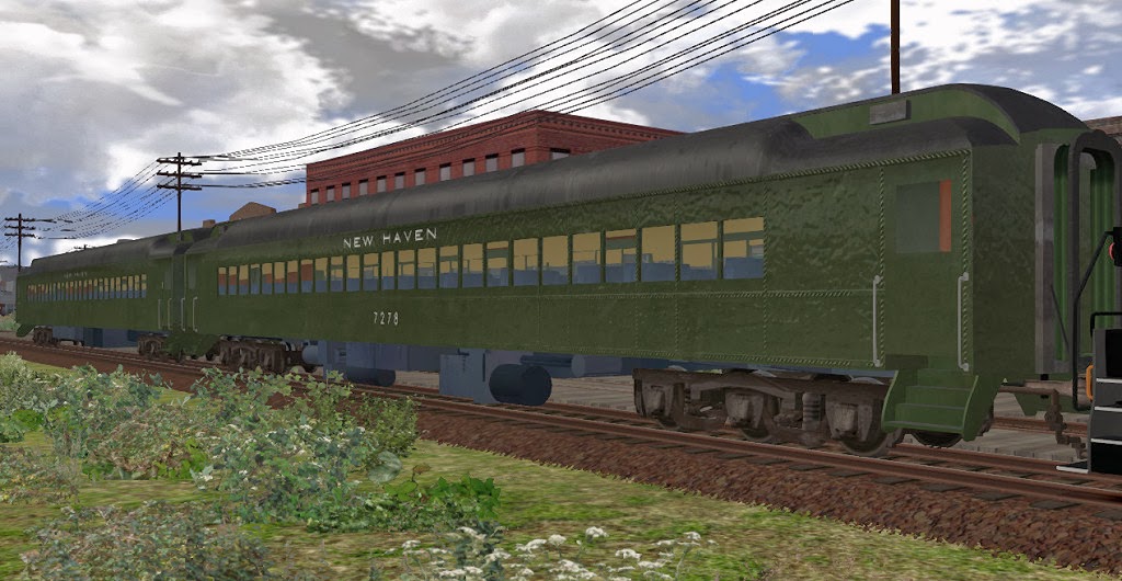
A new car is nearing completion, and so is version 1.0.
-
GreatNortherner - Posts: 1591
- Joined: Sun Feb 15, 2009 11:19 am
- Location: Czech Republic
Re: Virtual New Haven RR, a WIP project for RW
![]() by ozinoz » Thu Nov 28, 2013 7:54 pm
by ozinoz » Thu Nov 28, 2013 7:54 pm
Excellent 
Thanks for the update
Thanks for the update
- ozinoz
- Posts: 1622
- Joined: Fri Feb 20, 2009 1:59 am
- Location: Antipodes
Re: Virtual New Haven RR, a WIP project for RW
![]() by BlackJack » Fri Nov 29, 2013 4:29 am
by BlackJack » Fri Nov 29, 2013 4:29 am
is there interior? will you place route at Steam?
- BlackJack
- Posts: 53
- Joined: Tue Aug 27, 2013 3:45 pm
Re: Virtual New Haven RR, a WIP project for RW
![]() by imnew » Fri Nov 29, 2013 6:13 am
by imnew » Fri Nov 29, 2013 6:13 am
Nice !
Intel Core I7-7770K, ZOTAC GTX 1080 Ti AMP
Extreme, ASUS ROG Strix Z270H, 16 GB HyperX Fury DDR4, Samsung 850 EVO 500GB, Corsair Force MP500 240GB M.2, 34" Ultra Wide Samsung Monitor
Extreme, ASUS ROG Strix Z270H, 16 GB HyperX Fury DDR4, Samsung 850 EVO 500GB, Corsair Force MP500 240GB M.2, 34" Ultra Wide Samsung Monitor
-
imnew - Posts: 2456
- Joined: Tue Aug 25, 2009 1:41 pm
Re: Virtual New Haven RR, a WIP project for RW
![]() by buzz456 » Fri Nov 29, 2013 8:15 am
by buzz456 » Fri Nov 29, 2013 8:15 am

Buzz
39 and holding.
"Some people find fault like there's a reward for it."- Zig Ziglar
"If you can dream it you can do it."- Walt Disney
39 and holding.
"Some people find fault like there's a reward for it."- Zig Ziglar
"If you can dream it you can do it."- Walt Disney
-
buzz456 - Site Admin
- Posts: 21057
- Joined: Sun Mar 21, 2010 8:30 am
- Location: SW Florida
Return to Payware Announcements and Screenshots
Who is online
Users browsing this forum: No registered users and 0 guests