Just started the next skin. Not sure what will be in it other than this FURX.
Comparison shot, perhaps the Green needs changed.
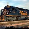
FURX SD40-2
FURX SD40-2
![]() by Marleyman » Thu Oct 17, 2013 7:15 am
by Marleyman » Thu Oct 17, 2013 7:15 am
You do not have the required permissions to view the files attached to this post.
My Railworks 2 Catalogue; http://www.railworks.marleyman.co.uk/
and My RWTS2013 Download Store http://www.railworks.marleyman.co.uk/store/
and My RWTS2013 Download Store http://www.railworks.marleyman.co.uk/store/
-

Marleyman - Posts: 357
- Joined: Fri Dec 10, 2010 4:46 pm
- Location: UK
Re: FURX SD40-2
![]() by Marleyman » Thu Oct 17, 2013 8:59 am
by Marleyman » Thu Oct 17, 2013 8:59 am
Day 1
You do not have the required permissions to view the files attached to this post.
My Railworks 2 Catalogue; http://www.railworks.marleyman.co.uk/
and My RWTS2013 Download Store http://www.railworks.marleyman.co.uk/store/
and My RWTS2013 Download Store http://www.railworks.marleyman.co.uk/store/
-
Marleyman - Posts: 357
- Joined: Fri Dec 10, 2010 4:46 pm
- Location: UK

Re: FURX SD40-2
![]() by imnew » Thu Oct 17, 2013 12:05 pm
by imnew » Thu Oct 17, 2013 12:05 pm
Thanks for taking on the FURX MM. Man, you are on a roll these days. 
Intel Core I7-7770K, ZOTAC GTX 1080 Ti AMP
Extreme, ASUS ROG Strix Z270H, 16 GB HyperX Fury DDR4, Samsung 850 EVO 500GB, Corsair Force MP500 240GB M.2, 34" Ultra Wide Samsung Monitor
Extreme, ASUS ROG Strix Z270H, 16 GB HyperX Fury DDR4, Samsung 850 EVO 500GB, Corsair Force MP500 240GB M.2, 34" Ultra Wide Samsung Monitor
-
imnew - Posts: 2456
- Joined: Tue Aug 25, 2009 1:41 pm
Re: FURX SD40-2
![]() by Marleyman » Fri Oct 18, 2013 9:38 am
by Marleyman » Fri Oct 18, 2013 9:38 am
Day 2
You do not have the required permissions to view the files attached to this post.
My Railworks 2 Catalogue; http://www.railworks.marleyman.co.uk/
and My RWTS2013 Download Store http://www.railworks.marleyman.co.uk/store/
and My RWTS2013 Download Store http://www.railworks.marleyman.co.uk/store/
-
Marleyman - Posts: 357
- Joined: Fri Dec 10, 2010 4:46 pm
- Location: UK
Re: FURX SD40-2
![]() by RvA944 » Fri Oct 18, 2013 11:00 am
by RvA944 » Fri Oct 18, 2013 11:00 am
Maybe you could sneek a Western Pacific in there too?
WP SD40-2 Roster
http://www.rrpicturearchives.net/locolist.aspx?id=WP&mid=6
WP SD40-2 Roster
http://www.rrpicturearchives.net/locolist.aspx?id=WP&mid=6
You do not have the required permissions to view the files attached to this post.
"Just smile and wave boy's, just smile and wave"
-

RvA944 - Posts: 210
- Joined: Sat Jul 13, 2013 9:35 pm
- Location: N.E. PA
Re: FURX SD40-2
![]() by PapaXpress » Fri Oct 18, 2013 11:28 am
by PapaXpress » Fri Oct 18, 2013 11:28 am
Err... you posted GP40-2 material, not SD40-2.
"Just post some random unrelated text. We have members here who can help you with that." ~ Chacal
"When all else fails, read the instructions... if that doesn't work either, try following them." ~ Old Prof
The Grade Crossing - Atlanta North Project - Virtual Rail Creations
-

PapaXpress - Posts: 5147
- Joined: Sat Oct 23, 2010 10:30 pm
- Location: that "other" timezone
Re: FURX SD40-2
![]() by RvA944 » Fri Oct 18, 2013 11:52 am
by RvA944 » Fri Oct 18, 2013 11:52 am
my bad............
walks away slow with head down
walks away slow with head down
"Just smile and wave boy's, just smile and wave"
-
RvA944 - Posts: 210
- Joined: Sat Jul 13, 2013 9:35 pm
- Location: N.E. PA
Re: FURX SD40-2
![]() by Giuseppe » Fri Oct 18, 2013 12:35 pm
by Giuseppe » Fri Oct 18, 2013 12:35 pm
Hey, that's looking pretty good! The only comment I have is that you should use Helvetica as your typeface, not Arial. The typeface on the prototype can be easily identified as Helvetica with its horizontal cuts and the distinctive "kicker" on its uppercase R (Arial's uppercase R, meanwhile, looks like a floppy noodle). Not many people would notice that, I guess, but using prototypical type can really add a lot to a model.
I look forward to seeing more progress!
Thanks,
Eliot
I look forward to seeing more progress!
Thanks,
Eliot
- Giuseppe
- Posts: 53
- Joined: Sat Sep 10, 2011 11:12 pm
Re: FURX SD40-2
![]() by Marleyman » Fri Oct 18, 2013 3:19 pm
by Marleyman » Fri Oct 18, 2013 3:19 pm
Helvetica is a payware fomt and Arial is the closest I have. I could and I most likely will, just photoshop the logo onto the side.
My Railworks 2 Catalogue; http://www.railworks.marleyman.co.uk/
and My RWTS2013 Download Store http://www.railworks.marleyman.co.uk/store/
and My RWTS2013 Download Store http://www.railworks.marleyman.co.uk/store/
-
Marleyman - Posts: 357
- Joined: Fri Dec 10, 2010 4:46 pm
- Location: UK
Re: FURX SD40-2
![]() by RvA944 » Fri Oct 18, 2013 3:25 pm
by RvA944 » Fri Oct 18, 2013 3:25 pm
I have Helvetica from some freeware site let me dig it out
"Just smile and wave boy's, just smile and wave"
-
RvA944 - Posts: 210
- Joined: Sat Jul 13, 2013 9:35 pm
- Location: N.E. PA
Re: FURX SD40-2
![]() by BNSF650 » Fri Oct 18, 2013 6:41 pm
by BNSF650 » Fri Oct 18, 2013 6:41 pm
Also while your in this colors you can do these.
You do not have the required permissions to view the files attached to this post.

New Era of Train Simulation
-

BNSF650 - Posts: 2016
- Joined: Mon May 31, 2010 10:27 pm
- Location: Texas
Re: FURX SD40-2
![]() by mysterytrain » Sun Oct 20, 2013 9:02 am
by mysterytrain » Sun Oct 20, 2013 9:02 am
Looks awesome!!!
Thank you very much Marleyman!

Thank you very much Marleyman!
-

mysterytrain - Posts: 569
- Joined: Wed Jul 11, 2012 3:58 pm
- Location: Georgia, U.S.A.
Re: FURX SD40-2
![]() by Marleyman » Tue Oct 22, 2013 6:21 am
by Marleyman » Tue Oct 22, 2013 6:21 am
Two sides to every story...
That is pixel by pixel painting and it is still not perfect. I think though, it is a good as it gets.
That is pixel by pixel painting and it is still not perfect. I think though, it is a good as it gets.
You do not have the required permissions to view the files attached to this post.
My Railworks 2 Catalogue; http://www.railworks.marleyman.co.uk/
and My RWTS2013 Download Store http://www.railworks.marleyman.co.uk/store/
and My RWTS2013 Download Store http://www.railworks.marleyman.co.uk/store/
-
Marleyman - Posts: 357
- Joined: Fri Dec 10, 2010 4:46 pm
- Location: UK
25 posts
• Page 1 of 2 • 1, 2
Who is online
Users browsing this forum: No registered users and 1 guest